REPS Lacrosse App Redesign

User Research, Interaction Design, Visual Design, UI/UX Design, Consulting
Project Overview
REPS is a lacrosse training app designed to give players the proper training and confidence they need to take their game to the next level. REPS wanted to update their visual identity and redesign their app to accommodate their brand new R1 Bluetooth ball (patent pending).
The Challenge
The amount of data that the R1 ball can collect could be digested and shown in a myriad of ways. We wanted to introduce the ball to the app in a way that showcased its many reasons for users to purchase it without alienating existing users who weren't going to buy one.
The REPS Brand & Creating a Design Library
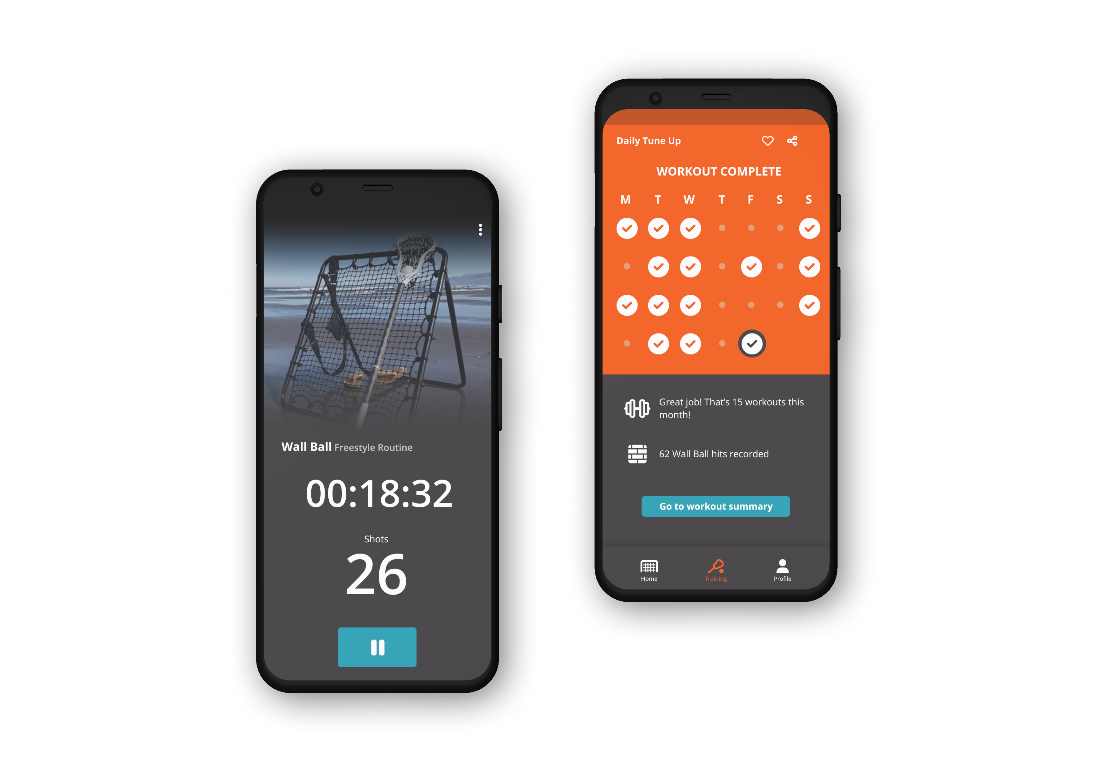
REPS brand is meant to be a down-to-earth, down-to-business company that most people come to expect from sports / training affiliated brands. It is a brand that's meant to inspire its users and give them a sense of engagement in the lacrosse community.

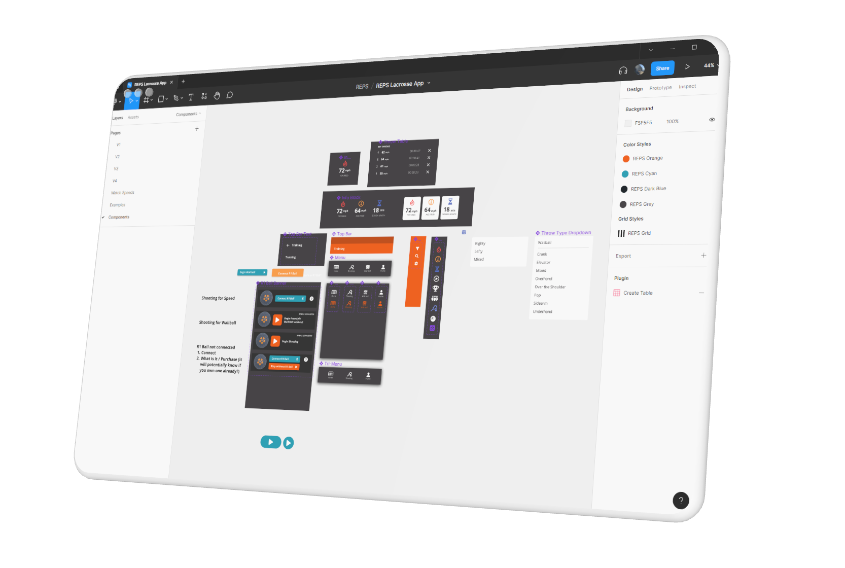
Creating the building blocks of a project is always one of the first steps I take. By creating a library like this, I'm able to change icons, buttons, and other reusable sections simultaneously. I'm also able to keep the look and feel consistent across the whole app.
Sketching Wireframes
Once I had some idea of how I wanted to tackle the design, I wanted to explore some layout options and flows. I also wanted to get a general sense of where things were hierarchically and what was linked to what. The existing app had a lot of users, so I didn't want to depart too terribly from some of the original layouts.